Here's an example of a Twitter bot sharing false information.
What people?
— 154,552 Sealed Indictments ⭐⭐⭐ (@Theresa78375601) March 23, 2020
Name them.
What better way to lead people to slaughter than to tell them the "experts" say we need this.
HOW MANY DIED UNDER OBAMA? (H1N1) pic.twitter.com/t9AyfXm8DA
What looks wrong about this? First of all, I personally remember the H1N1 flu. People were initially concerned about it, but it turned out to be a regular flu. At least one of my close family members eventually was diagnosed with it, had only mild symptoms, and was told not to worry. I don't even remember if I had it. The idea that H1N1 killed one of out every five sufferers is simply not plausible to me; it does not track with my own memory.
How do I check the data in this image? Conveniently for me, the fakers left the news outlet's logo, "Business Insider," in the image of the chart. Perhaps this was intentional, to make the chart appear more official. However, it also allows me to easily research whether this is indeed a Business Insider chart. I simply Google the name of the publication together with the title or keywords from the alleged material ["Business Insider" "Wuhan coronavirus compared to other major viruses"].
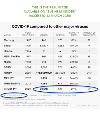
Here's the real information. The Business Insider chart (from an article dated 30 January 2020, viewed 23 March 2020) is different from what the bot shared on Twitter. It's clearly modified to make the 2009 H1N1 virus look more dangerous than it was.
Another difference between the charts is that the fake one has "Wuhan coronavirus" data updated as of 30 January, while the real one has "COVID-19" data checked again as of 4 February. Business Insider's original chart indeed likely used the name "Wuhan coronavirus" (it's still used in their article). The name "COVID-19" was probably swapped out later, as that name was announced on 11 February, so Business Insider probably updated their chart later to reflect the new name (and didn't provide a new "as of" date, because the data is still only current as of 4 February).
The difference in the name of the coronavirus is therefore not concerning; Business Insider is entitled to update their own images at any time to reflect better terminology. What is concerning is the difference in the H1N1 data from 2009, which could not have changed. The H1N1 virus ultimately had a fatality rate of 0.02%. The false chart is claiming that H1N1 was around 870 times more lethal than it was.
You'll notice I edited the JPGs directly to indicate which is false and which is real. I want you to know the reason why I put that information in the JPG and not merely as text captions within this blog post! It's because I don't want the false JPG to spread any further.
And who is responsible for the spread of false information on social media? The people who create these bots, and the Twitter executives who allow the bots to exist.


No comments:
Post a Comment